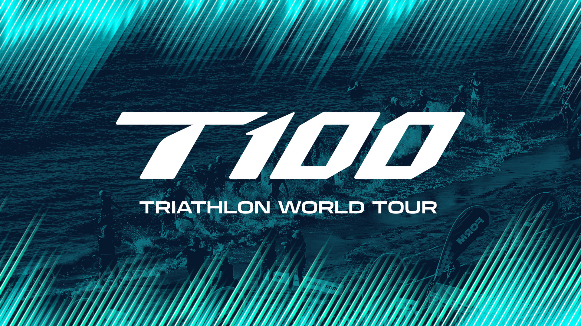
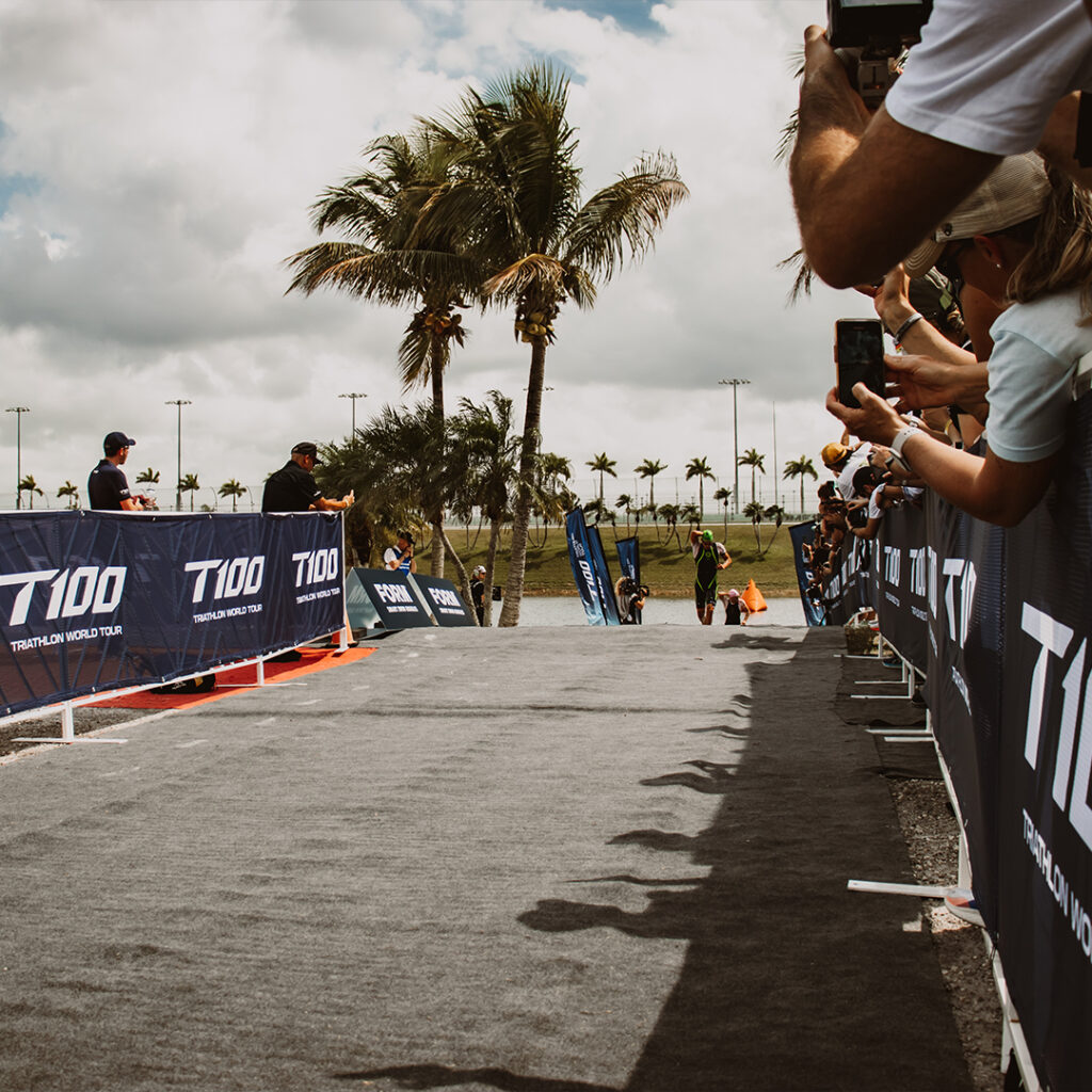
The PTO came to us with the aim of redefining triathlon – by creating a new brand for its flagship 100km event.
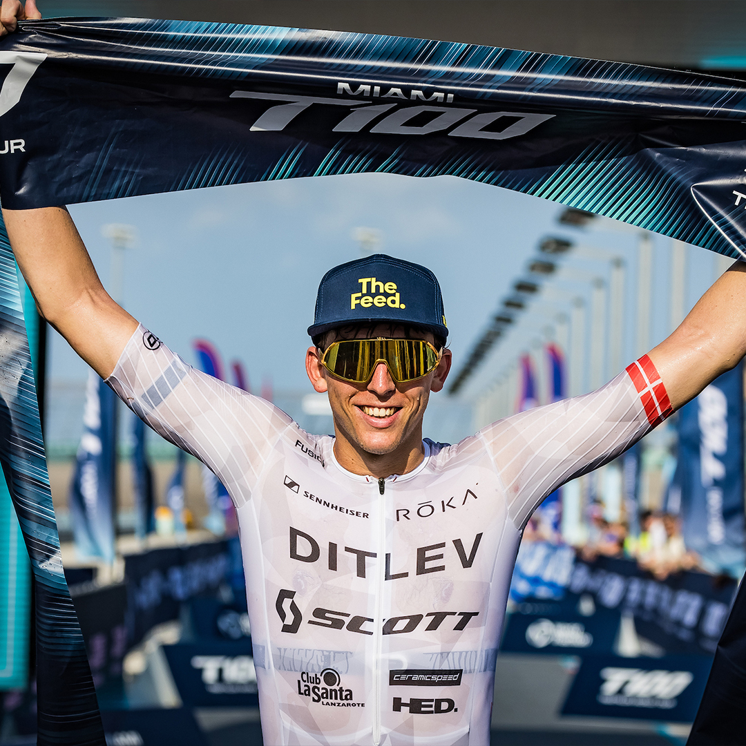
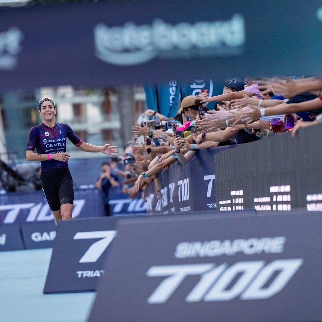
We developed a brand strategy that would showcase the athletes as heroes pushing the limits of human sporting performance – the planet’s ultimate athletes – and so the new name, T100, highlights the unique and epic distance of the race.
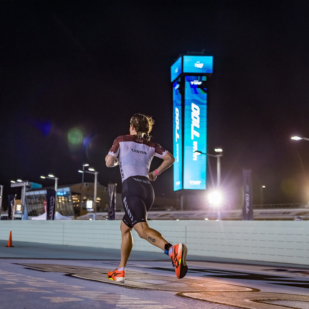
Swim, bike, run
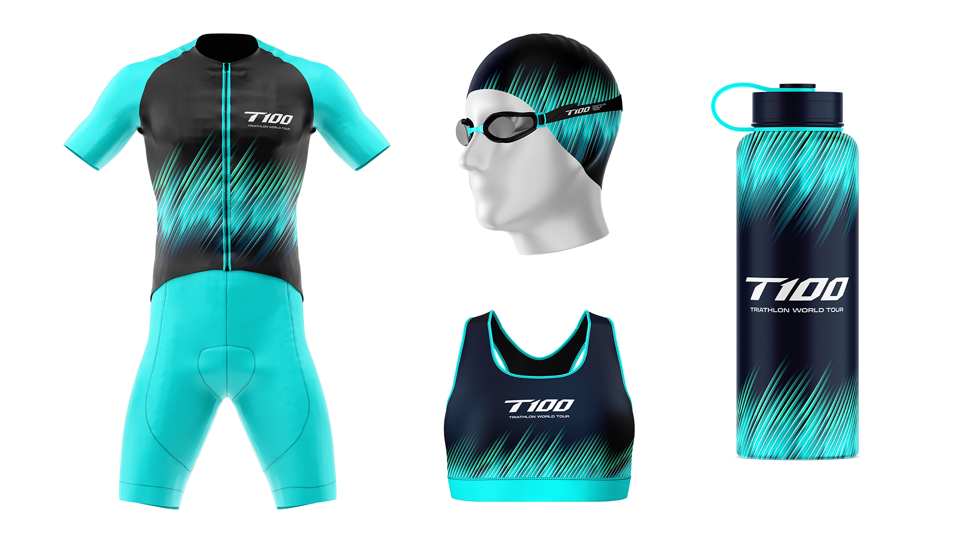
At the heart of the brand’s new visual identity is a graphic inspired by the heart rate of an athlete during a triathlon, made up of three sets of 100 individual lines, referencing the sport’s three disciplines (swim, bike, run).
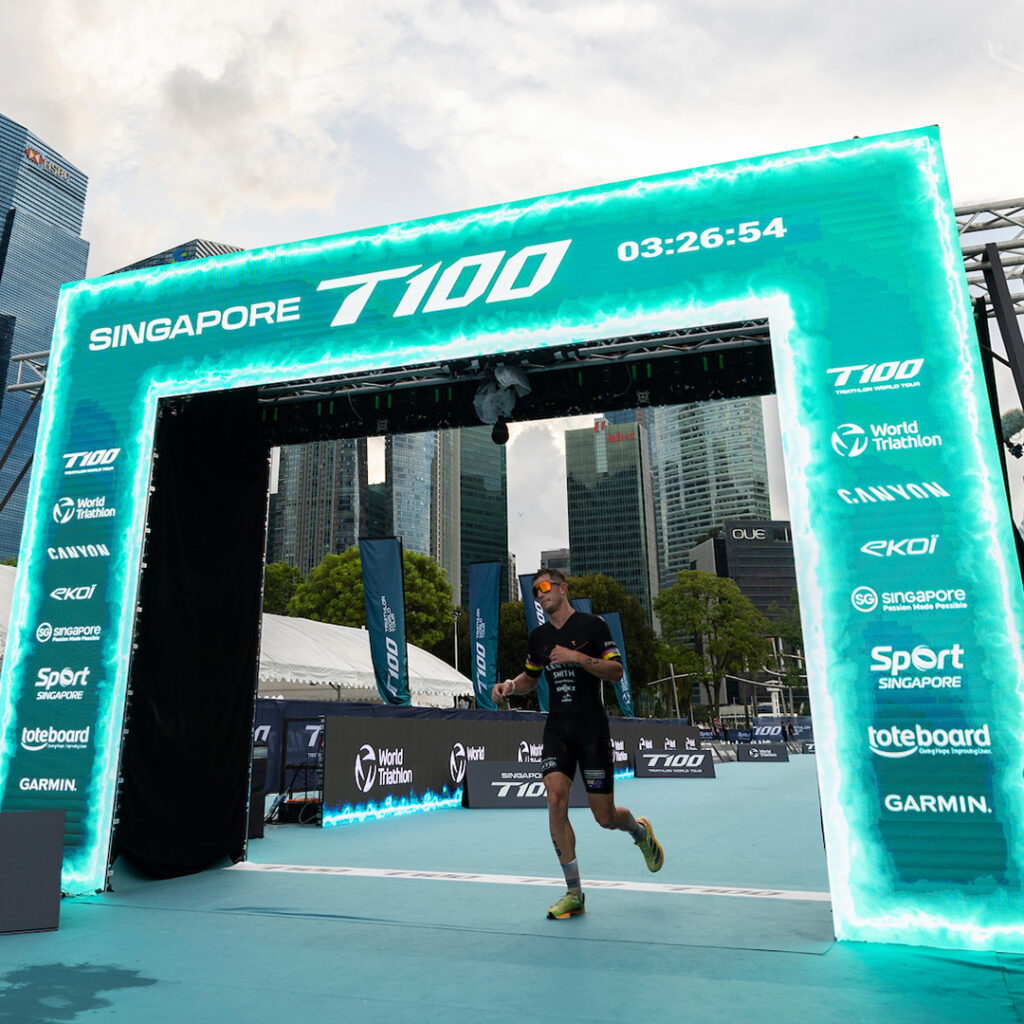
a global brand fit for iconic locations
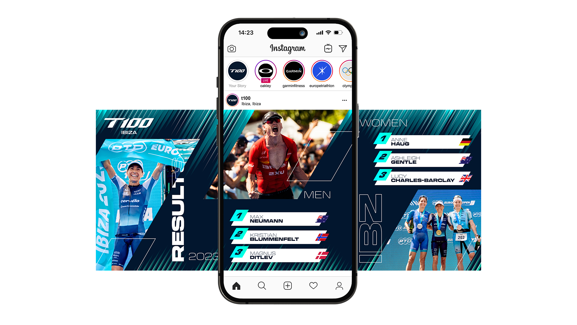
The 2024 season will see 8 races taking place in iconic locations around the world, with the sport’s top 20 male and female athletes competing to become the inaugural T100 World Champion. In growing the sport they hope to make these athletes household names.